
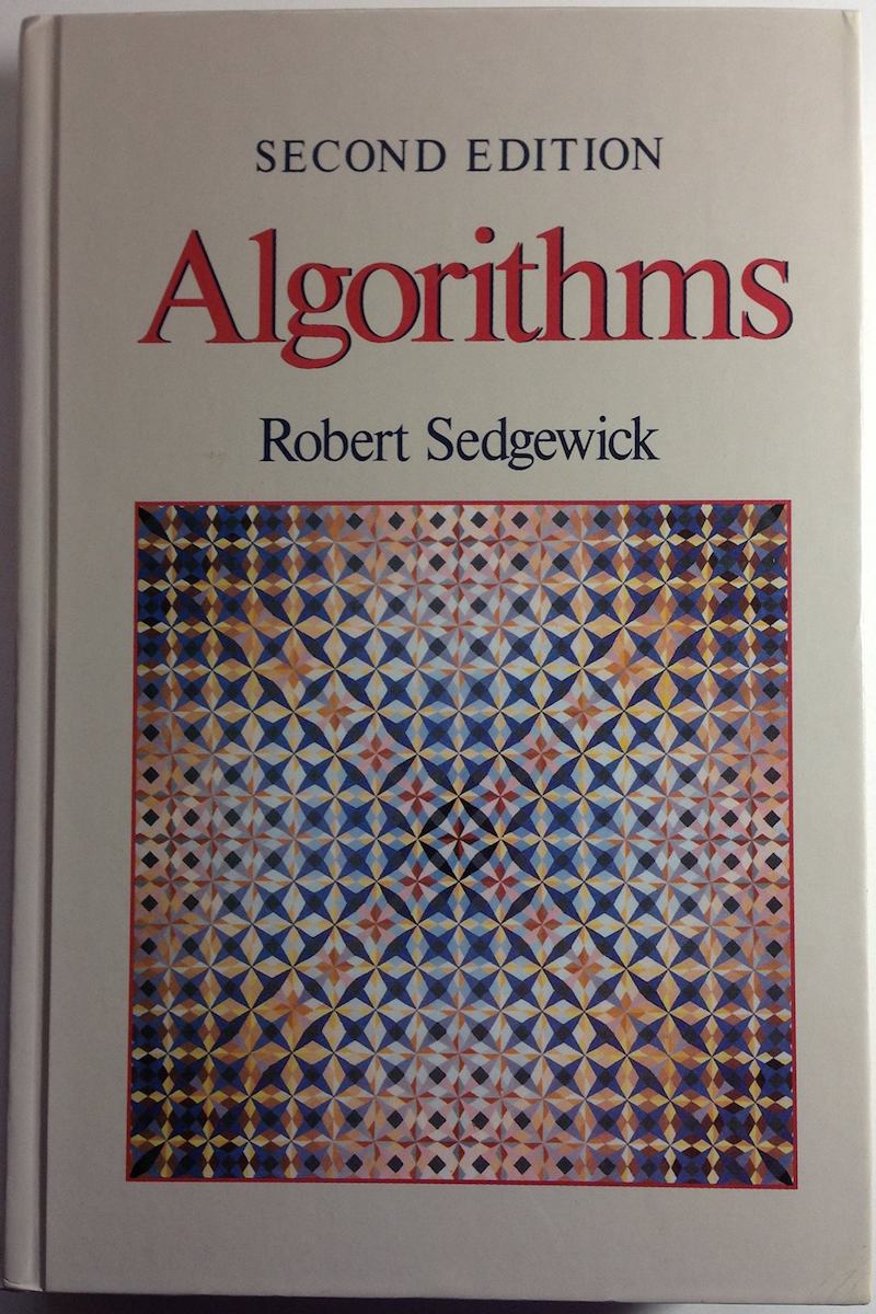
 ột phần quan trọng của 4 năm ĐH nằm trong cuốn này. Sách ngoại văn bìa cứng, bản in đẹp giấy tốt, đồng giá 50K/cuốn. Những năm 199x, FAHASA nhập sách ngoại về, bán chẳng ai mua, canh me đi qua lúc nó sale off, xúc luôn một lúc cả chục cuốn, từ Algorithms, Data structure, Database, Computer graphics… cho đến Algebra, Statistics, Mathematical Analysis, etc… Cũng là lý do tại sao thuật ngữ Toán, Tin… ko hề biết tiếng Việt. Cũng chưa thấy cuốn sách Tin học nào hay và bổ ích như cuốn này. Nói cho đúng là cái cách hành văn khoa học tiếng Anh của nó ám ảnh mình, ít khi thấy được một cách hành văn hay, súc tích, dể hiểu đến như thế, cộng thêm minh hoạ cực kỳ xinh đẹp.
Nếu nói mức độ hiểu vấn đề nó thể hiện qua cái khả năng diễn đạt, trình bày lại để cho người khác cũng hiểu vấn đề đó thì tác giả cuốn này đúng là siêu đẳng! Về sau phát hiện ra, cả thư viện Đại học KHTN cũng chỉ có đúng một cuốn này, mình có riêng một cuốn! Không có thói quen đọc nhiều sách, theo mình, cả ĐH chỉ cần đọc chừng 3, 4 cuốn, và cả cuộc đời chắc không cần đến 20 cuốn. Đọc nhiều phí hoài tuổi xanh đi! Dự định sau này mình sẽ đóng cái kệ sách cao đến sát trần nhà, bỏ bớt những cuốn không đọc lên trên cao để không phải đụng đến chúng! 😅 Sách thực sự hay thì ít như sao buổi sớm, mà sách lôm côm lại nhiều như… lá rụng mùa thu! Sau bác nào đó thấy sách ngon, mượn ko trả, tiếc đứt ruột! 😥
 ritten with a Pencil stylus on an iPad using


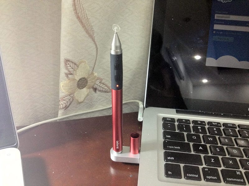
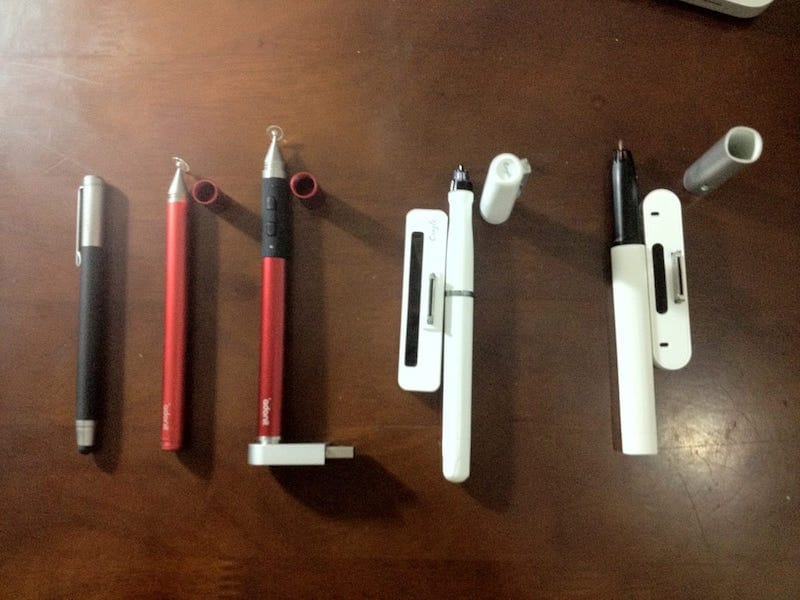
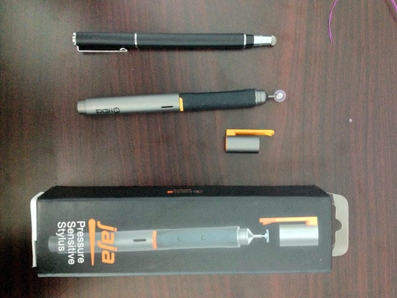
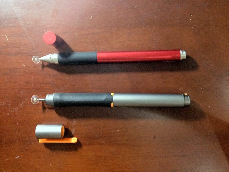
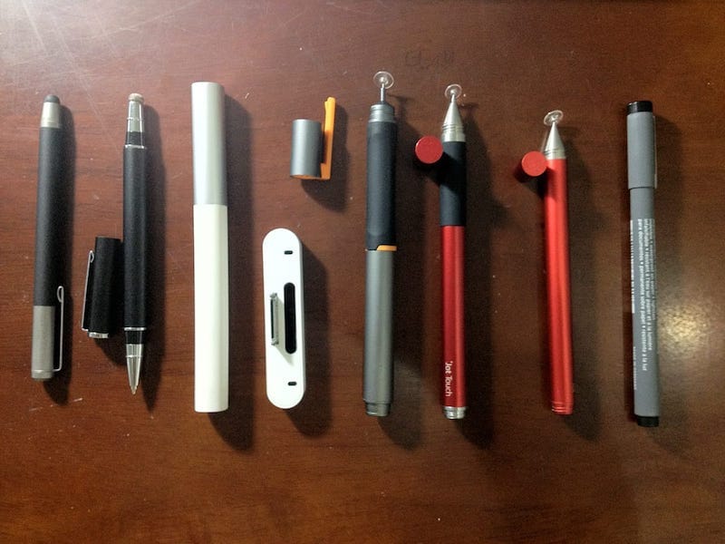
 was playing around with some iPad’s styli lately and here they’re: the Wacom Bamboo stylus, TruGlide, Adonit Jot, Adonit Jot Touch, Jaja, Cregle’s iPen and ByZero. I’ve been loving the smoothness of Bamboo, but TruGlide is really an excellent one! The new Adonit Jot Touch seems to be promissing, and on the second position is Jaja (for pressure sensitive styli).
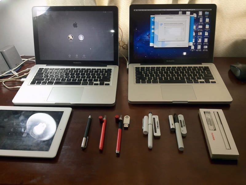
 gày nào, cho tôi biết, biết yêu em rồi, tôi biết tương tư, sau đây là câu chuyện tình tôi tự kể,

 ust got the new iPad (or we called it: the iPad 3) in hand today and I’m stunned by it’s new retina display. There’s not such a fever like when the iPad 2 was released, I guess since the new iPad is almost identical to iPad 2 in appearance, people will consider about the fact that they won’t be able to show it off. In term of general performance, iPad 3 does not stand out to the previous iPad, or it could be worse in term of 3D – OpenGL performance according to some reviews. From a programmer’s point of view, this could easily be understood since doubling the resolution means 4 times the memory and processing power for each graphics API, which also means Apple has been pushing things over the Moore law’s limit!
 aving written myself numerous UI widgets, from simple to complex, from Windows to Linux, from 2D to 3D… but I’ve just started writing iOS widgets not too long ago. Making iOS widgets is really fun, for we have supports from the most powerful 2D graphics system ever built, that is CoreGraphics (Quartz 2D).


 his is part of the really fascinating broader concept of