Win vs. Mac font rendering (and the way for Linux)

We could easily see the very poor font rendering quality of Windows right on Windows itself using Safari. Safari has different smoothing modes (image above) and another mode named “Windows’ standard” (image below)


Differences between font rendering on Ubuntu (above) and Windows (below).

everal years ago, on earlier versions of Fedora, Ubuntu… font rendering is just a crap! Many people would find Windows better at text rasterization, and both are far inferior compared to Mac. In latest versions of Linux desktop, things are much improved, while Windows (Vista, Win7) is still much lagging behind, Linux made bold advances from lessons learned from both Win and Mac!

Novice users on Windows would find its text sharper, clearer and easier to read, while Mac’s one is a bit blurry! That is because Mac and Win have different origins and targets! Apple has deep legacy in graphics designs and desktop publishing, its algorithms try to preserve the nature of typefaces as much as possible, which implement true sub-pixel rendering aiming at high-resolution output devices. Meanwhile, Win sticks to pixel unit and aims at low-resolution device (like computer screen which usually less than 100 dpi in resolution).

The consequence is that while Win’s text look sharper and clearer on screen, it would turn into a whole crap when come to printing, where Mac’s publishing products are closer to its screen look! Even worse, Windows text rendering solutions are just suitable for simple typefaces, when complex, high-quality font is needed, the output is usually very poor due to various wrong implementations in hinting, anti-aliasing, kerning algorithms. This paper (2007) addresses in details many Microsoft’s implementation problems, and suggest the correct ways for text rasterization, resulting in a now-much-better Linux desktop!

(If you’re using a Mac or a Linux desktop, you would see this blog text in VN URW Gothic L, a aesthetically fine font. Windows readers would only see the text in Arial, as I have to turn off font embedding for Windows due to its very poor presentation.)

Update, Feb, 20th, 2011

The font used now is Tex Gyre Adventor, an enhanced font based on URW Gothic L, you can see the hinting is quite better, especially for Vietnamese text. The trade – off is that file size is much larger, almost triple the URW Gothic L’s size.

3d particles

ome funs with 3D effects. Just some years ago, rendering 3D particles like water, smoke, fire, fog… was an extremely hard task. I remember how struggling it was for me to build 3D models for a waterfall (with moving water) or a shouting-crowd stadium. It’s enjoyable to see how graphics has advanced in the past few years, these effects are now easily achievable.

Video above: the classical Utah teapot with steam coming out from its spout, rendered with Panda3D, the well-known open-source game engine originally released by Disney, which has a feature-rich C++ core with Python scripting for application development.

basic algorithms

The book is my primary source of interest while being a freshman, which presents a wide range of algorithms in a very coherent and systematic way. I remember “rescuing” this hard-copy from a Fahasa‘s junk pile for about 4 USD, which from that time on became a student’s most precious thing! You can read the soft-copy here.

his is among the subjects I was very fascinated the early years at university: algorithms, graph theory, geometry, image processing… I was not quite good at “symbolic” math (like algebra), but “visual” math offered me much inspiration. The thing I would remember most is Robert Sedgewick‘s Algorithms, a book that I’ve read through over and over again many many times. It is indeed the most important Computer Science textbook that beginners MUST read until today.

The Java applet below is “refurbished” from the code I wrote the first year at college, which visualizes the nature of different sorting algorithms (original code was written in Borland C++ 3.1 with BGI – Borland Graphics Interface). This is among my various attempts to visualize the knowledge collected from the book, which had taught me that even a simple thing like “bubble sort” is not that “very simple”! Let select an algorithm in the dropdown list and click ‘Start’ and see the differences!

My visualizations above are very early (1997), much prior to those demonstrations on wiki. Later on, I’d learned that the author R.Sedgewick put a great emphasis on algorithms’ visualizing himself, his work used PostScript. Many new ways of visualization are really impressive and easy to understand, such as this (using JavaScript).

I started with with C/C++ at school, then continue with C/C++, Java, Design Patterns… on various projects. Later I abandoned Design Patterns (and Java), then I abandoned C++. To me there’s no Design Patterns, there’s only data structures and algorithms! Would write another post on the bloating and non-sense usages of Design Patterns later on!

It seems that most software engineers today lack fundamental knowledges and skills. It’s quite apparent that you could not rely on a guy talking about architecture, GoF’s design patterns… all the time but can not state the algorithmic differences between a DFS (depth first search) and a BFS (breadth first search).

parallax

“3D clip” made by myself just for fun, strictly speaking, this is not 3D video but rather a pseudo – 3D effect, parallax, (tiếng Việt: thị sai) created totally from still images (see on the left). My video is partially inspired by this excellent CSS – only parallax. It’s quite easy to figure out how to acquire this, but let read about the definition from wiki.

This is also a popular technique in game programming, some early (and current) games choose to reduce a full 3D scene to several layers, some use parallax – mapping to acquire a pseudo – spatial effect, all helps eliminating excessive 3D computations. Clip made from random still images captured at Khe Gà, Phan Thiết.

typeface resources

Classical typesetters have delivered custom typography since the 15th century. Internet could not until now… Western typography had professional typefaces since the 15th century. Vietnamese still not has good-looking publishing fonts until now…

n my career, it’s among my habits to ask people whether they really understand basic things, it turned out many many times that it’s not so easy with even the basic programming techniques, basic algorithms & data structures… 😢 Just like the a, b, c… in the alphabetical table, even write a character down in a beautiful manner is not easy! Below I would try to cover some resources in learning the use of typefaces in designing.

3d graphical user interface

The code is written in C++ base on Clutter 1.2.4 library. It shows basic widgets: tabbed container, scrolling container, list box, combo box, check box, edit box, button, label, radio button…

his is my personal project in which I tried to evaluate some new ideas and concepts in using 3D techniques for GUI (Graphical User Interface). It’s quite tiny indeed (about 6000 LOC – line of code), all written by myself in about a month (mostly in my free times at weekends). So please don’t blame me on some un-completed or un-polished features, they are just for testing the ideas only. I would try to examine the trend of applying 3D graphics to GUI, but first, let have a look at the video below.

1.   The first thing to consider is not 3D engines or hardwares, it is about usability. Many traditional (2D) GUI out there are already complex and obstructive. GUI is about information presentation and presentation should be really simple and clear so that even my grand mother can understand and use. I’ve been seeking, trying to explore many new ways invented to represent information in 3D (or 2.5D) space, and I could say only a very very small percent of them could make a usable value. Users have long been familiar with 2D, and yet 3D hasn’t been very much persuasive.

2.   3D hardwares can be categorized into 3 groups (as listed on the left), and the 3D engine can be configured to off-load calculations to hardware. With the 1st type of device, only bitmap operations could be off-loaded. With the 2nd type of device, many drawing operations (the path_xxx functions) can be off-loaded. The 3rd type of hardware is most valuable since we can have its finish for ourselves a lot of work.

It’s important to understand the target device our software stack would be running on. If it is an out-date machine with just some blitters, we should use paint-like (aka: bitmaps) operations, while on most modern PC, draw-like (aka: 2D vector) operations are more encouraging. While bitmaps may offer nicer and more customizable GUI, the cons is it lacks the scalable ability that vector has.

3.   The last is about software implementation. Many of the graphics concepts are first introduced in software, which then embedded to hardware, which then standardized by software (like OpenGL or DirectX) again. Thus, many elements of a graphics pipeline is the production of a long history of interactive evolution. A graphics pipleline is not a general framework, it depends on very detailed, in-depth techniques to be operational in real-world application.

Game & graphics are the domains where most formal software methods would easily failed. 3D graphics developers should have good knowledge on graphics in general (bitmap and vector drawing), geometry, linear algebra & discrete maths, deep understanding on data-structures and algorithms… are strong pluses, advanced tips & tricks in coding and optimization is a must (game & graphics programming has always been a hell of tricks from the age of dawn) and finally good understanding on 3D techniques (model, scenegraph, projecting, shading, clipping, lighting, effects…)

typeface

All names on the Vietnam wall in Washington DC was carved in Optima, a font designed by the legendary Hermann Zapf. Optima style is well-balanced between ancience and modernity, it’s said that Zapf used golden ratio in designing it!

ince it began long time ago, my obsession for typefaces has never stopped. From typography to calligraphy, from Latin letters to Chinese brush characters, from hand-writing to web fonts… typefaces represent the most basic, most intrinsic but most important to a visual identity: it’s not the thing they see, it’s the thing they read! Typeface, it’s not about a style of writing or printing, it’s about the long traditions of hand writing, wood and metal letters printing continue into the digital age, it’s about aesthetics!

Nowadays, for typography, www is still the “lowest common denominator”, where just a handful of typefaces meet. It’s really hard to demonstrate the beauty of typefaces on the web. Previously I had a post on web embedded font, other solutions exist using Flash or JavaScript to render fonts on web pages. Up-to the present day, I’ve never felt pleased with the aesthetics quality of any Vietnamese font yet!

Take a look at our major (printed) newspapers (e.g: Tuoi Tre, Thanh Nien…) and even art & designing magazines, most of them sticks to the very basic (and ugly) Arial or Verdana, why don’t they consider using more elegant ones like Helvetica or Palatino? (these have Vietnamese Unicode support already) Yet, there are also many nice free font families to use: Gentium, Liberation, DejaVu, Linux Libertine, Droid, Bitstream Vera

Look at the prices of professional fonts sold on many type foundries, you would understand values of the work! A font designer is somewhat similar to a sword-maker, their names don’t appear on publishing, book, newspaper… but those products bear the tacit pride of centuries-old craftsmanship. Image below: the flowery Zapfino, named after Hermann Zapf, shipped with Mac OS X, now serving as test-bed for many font-rendering engines.

3d

e are building something like this, a 3D user interface. Day by day, we’re witnessing more and more diversities in computer user interface: concepts, designs, look and feel, animations, effects… While some would stick to an bare – bone, obscured text console, the others prefer some fancy, eye – candy GUI with all its bells & whistles. Things are much easier now with many 3D libraries and tools. Remind me about how I did all the 3D things: polygon, mesh, texture, sprite, shading, lighting, scene – graph, etc… with C & assembly on DOS!

ô ăn quan

Có 50 quân dân, và 2 quân quan, mỗi quan tương đương 10 dân. Người chơi có quyền chọn di chuyển theo hướng bất kỳ, những game Mancala khác chỉ được di chuyển theo một chiều nhất định.

Ăn quân ở ô kế tiếp trong lượt đi chứ không phải ở ô đối diện của đối phương. Khi đến lượt mình mà không còn quân để đi thì phải bỏ 5 quân đã ăn được vào 5 ô của mình để tiếp tục chơi. Trường hợp không có đủ 5 quân thì phải vay của đối phương và trả lại khi trò chơi kết thúc.
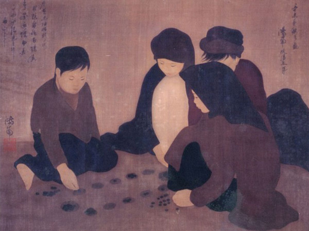
rò chơi dân gian Việt Nam Ô ăn quan thuộc họ Mancala, có nguồn gốc châu Phi và có hàng chục biến thể khác nhau trên thế giới. Khi nhỏ, tôi có chơi trò này vài lần, gọi theo tên địa phương là Ô làng chứ không phải Ô ăn quan. Hôm nay thử nhìn cái game này dưới góc độ tin học xem sao! Ô ăn quan có một số luật khác với những game Mancala khác.

Những luật bên, nhất là luật thêm & mượn quân làm Ô ăn quan phức tạp hơn nhiều so với những biến thể Mancala khác. Viết một chương trình cho máy tính chơi Ô ăn quan không phải là quá dễ dàng, dùng những heuristic đơn giản (hill-climbing, min-max, hay brute-force đến một độ sâu nhất định…) không đủ bảo đảm máy tính sẽ thắng trong nhiều trường hợp.

Trên internet, tôi không tìm được game Ô ăn quan nào theo đúng luật Việt Nam. Một số là những biến thể gần giống Ô ăn quan, một số tác giả claim là đã viết Ô ăn quan nhưng không cung cấp được link download. Có vẻ như game này không dể như khi vừa mới nghĩ đến! Bạn nào có ý kiến về chiến thuật chơi game này xin được trao đổi để cùng phát triển một trò chơi hoàn chỉnh.

Bên đây là screenshot của một Java applet tôi vừa viết trong vài tiếng đồng hồ, cho phép 2 người chơi với nhau (máy tính chỉ kiểm luật, chưa phải là một chương trình cho máy tính chơi thực sự). Những hiệu ứng đồ họa: di chuyển quân, ăn quân nhìn rất giống thật, graphics được vẽ bằng Photoshop: những viên sỏi và bàn chơi được vẽ bằng phấn trên mặt sân xi-măng… gợi lại những kỷ niệm thủa nhỏ.

minesweeper

wo more hours of work and I’ve added this hexagonal tiles to my MineSweeper! Anyone interested in the game can found the tiny binary and source code (450 LOC) here. Mine sweeping with hexagons is quite a different experience! More about MineSweeper, a simple game?

On the left: Minesweeper with hexagonal tiles