chinese rendering server

n my previous post, we can see the image – replacement technique being applied to mathematical formulas rendering. Replacing text by image can be seen in various Web’s techniques, mainly to display things that browser can’t! It’s a possibility that many Web technologies would never converge into common “form factors”: how many years have passed but SVG is still not supported on all browsers, how font technologies are still fighting stiffly with each other? Various issues would always remain unresolved and image replacement, though ugly and inconvenient, could be used as a temporary solution.

As you can see in the image above: the first line is a popular Chinese straight – stroke font that can be seen on most browsers, the next lines are nice calligraphy (brush – stroke) fonts that can hardly be seen on the web! I’m going to try using FreeType2 for a very specific problem: rendering Chinese fonts, the only reason is just simple: aesthetics! Searching around, I can’t find any simple, standalone solution: nice Chinese fonts are very big, a typical ttf file has size from 5MB to 50MB depending on the character set and quality (with that size, it’s obvious that we should use a server side solution). Packages like Pango or Cairo are too complex, and would require additional dependencies (which is unavailable on a free Linux host).

It takes me a whole day struggling with FreeType2’s reference and manual to get it work with Chinese fonts (quite different from conventional Latin fonts indeed), and finally here it is! You can access the executable at: http://tkxuyen.com/freetype2.php with the following syntax: freetype2.php ? text=… &font=… &size=… &color=… here is an example. Below are renderings with different sizes (anti – alias works really well):

text=洛阳城东桃李花飞来飞去落谁家&font=2&size=11&color=111111
text=洛阳城东桃李花飞来飞去落谁家&font=2&size=12&color=111111
text=洛阳城东桃李花飞来飞去落谁家&font=2&size=13&color=111111
text=洛阳城东桃李花飞来飞去落谁家&font=2&size=14&color=111111
text=洛阳城东桃李花飞来飞去落谁家&font=2&size=15&color=111111
text=洛阳城东桃李花飞来飞去落谁家&font=2&size=16&color=111111
text=洛阳城东桃李花飞来飞去落谁家&font=2&size=18&color=111111
text=洛阳城东桃李花飞来飞去落谁家&font=2&size=19&color=111111

and renderings with 3 different Chinese fonts (very big files, installed on server) and in different colors. Just note these fonts are a bit non-standard: they produce traditional Chinese characters as output, but only accept simplified Chinese as input:

text=洛阳城东桃李花飞来飞去落谁家&font=2&size=19&color=FF1111
text=洛阳城东桃李花飞来飞去落谁家&font=1&size=19&color=11FF11
text=洛阳城东桃李花飞来飞去落谁家&font=0&size=19&color=1111FF

Update, Jun 6th, 2021:

Due to some changes on my web-hosting, CGI is disabled for some reason. I really don’t have time to figure out why, so just temporarily remove the Chinese font rendering for now!
FreeType2 is an very handy open source library, it’s available on many flatform: Unix, Dos, Windows, Mac, Amiga, BeOS, Symbian… and it does a very good job of handling typefaces! Since FreeType2’s patent issues have expired since May, 2010, we would see an increasing application of FreeType2 in many areas.

This is my very simple C code (~250 LOC) to experiment with FreeType2: loading font, loading glyph, rendering bitmap, dealing with Unicode… To compile, just something like: gcc gifsave.c freetype2.c -o freetype2.cgi `pkg-config --cflags --libs freetype2`. I hope I can have time to extend the code into a more usable form: multi – line layout, alignment, RTF support, etc… Some restrictions are imposed to protect the server, if some text can’t be rendered (e.g: rendering dimensions are too large), an error image like this is displayed instead:

Win vs. Mac font rendering (and the way for Linux)

We could easily see the very poor font rendering quality of Windows right on Windows itself using Safari. Safari has different smoothing modes (image above) and another mode named “Windows’ standard” (image below)


Differences between font rendering on Ubuntu (above) and Windows (below).

everal years ago, on earlier versions of Fedora, Ubuntu… font rendering is just a crap! Many people would find Windows better at text rasterization, and both are far inferior compared to Mac. In latest versions of Linux desktop, things are much improved, while Windows (Vista, Win7) is still much lagging behind, Linux made bold advances from lessons learned from both Win and Mac!

Novice users on Windows would find its text sharper, clearer and easier to read, while Mac’s one is a bit blurry! That is because Mac and Win have different origins and targets! Apple has deep legacy in graphics designs and desktop publishing, its algorithms try to preserve the nature of typefaces as much as possible, which implement true sub-pixel rendering aiming at high-resolution output devices. Meanwhile, Win sticks to pixel unit and aims at low-resolution device (like computer screen which usually less than 100 dpi in resolution).

The consequence is that while Win’s text look sharper and clearer on screen, it would turn into a whole crap when come to printing, where Mac’s publishing products are closer to its screen look! Even worse, Windows text rendering solutions are just suitable for simple typefaces, when complex, high-quality font is needed, the output is usually very poor due to various wrong implementations in hinting, anti-aliasing, kerning algorithms. This paper (2007) addresses in details many Microsoft’s implementation problems, and suggest the correct ways for text rasterization, resulting in a now-much-better Linux desktop!

(If you’re using a Mac or a Linux desktop, you would see this blog text in VN URW Gothic L, a aesthetically fine font. Windows readers would only see the text in Arial, as I have to turn off font embedding for Windows due to its very poor presentation.)

Update, Feb, 20th, 2011

The font used now is Tex Gyre Adventor, an enhanced font based on URW Gothic L, you can see the hinting is quite better, especially for Vietnamese text. The trade – off is that file size is much larger, almost triple the URW Gothic L’s size.

typeface resources

Classical typesetters have delivered custom typography since the 15th century. Internet could not until now… Western typography had professional typefaces since the 15th century. Vietnamese still not has good-looking publishing fonts until now…

n my career, it’s among my habits to ask people whether they really understand basic things, it turned out many many times that it’s not so easy with even the basic programming techniques, basic algorithms & data structures… 😢 Just like the a, b, c… in the alphabetical table, even write a character down in a beautiful manner is not easy! Below I would try to cover some resources in learning the use of typefaces in designing.

typeface

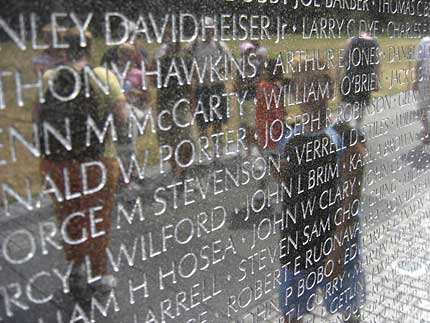
All names on the Vietnam wall in Washington DC was carved in Optima, a font designed by the legendary Hermann Zapf. Optima style is well-balanced between ancience and modernity, it’s said that Zapf used golden ratio in designing it!

ince it began long time ago, my obsession for typefaces has never stopped. From typography to calligraphy, from Latin letters to Chinese brush characters, from hand-writing to web fonts… typefaces represent the most basic, most intrinsic but most important to a visual identity: it’s not the thing they see, it’s the thing they read! Typeface, it’s not about a style of writing or printing, it’s about the long traditions of hand writing, wood and metal letters printing continue into the digital age, it’s about aesthetics!

Nowadays, for typography, www is still the “lowest common denominator”, where just a handful of typefaces meet. It’s really hard to demonstrate the beauty of typefaces on the web. Previously I had a post on web embedded font, other solutions exist using Flash or JavaScript to render fonts on web pages. Up-to the present day, I’ve never felt pleased with the aesthetics quality of any Vietnamese font yet!

Take a look at our major (printed) newspapers (e.g: Tuoi Tre, Thanh Nien…) and even art & designing magazines, most of them sticks to the very basic (and ugly) Arial or Verdana, why don’t they consider using more elegant ones like Helvetica or Palatino? (these have Vietnamese Unicode support already) Yet, there are also many nice free font families to use: Gentium, Liberation, DejaVu, Linux Libertine, Droid, Bitstream Vera

Look at the prices of professional fonts sold on many type foundries, you would understand values of the work! A font designer is somewhat similar to a sword-maker, their names don’t appear on publishing, book, newspaper… but those products bear the tacit pride of centuries-old craftsmanship. Image below: the flowery Zapfino, named after Hermann Zapf, shipped with Mac OS X, now serving as test-bed for many font-rendering engines.