
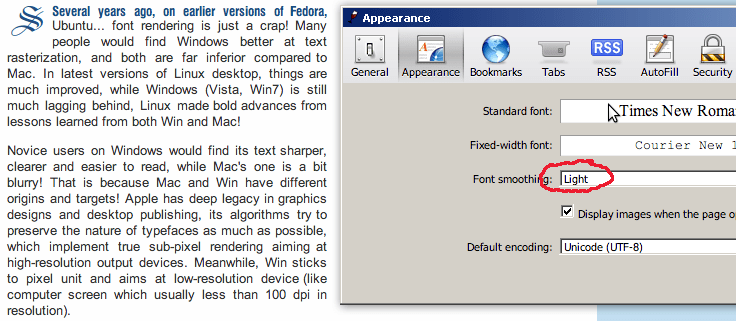
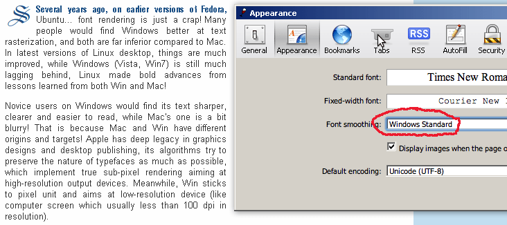
We could easily see the very poor font rendering quality of Windows right on Windows itself using Safari. Safari has different smoothing modes (image above) and another mode named “Windows’ standard” (image below)
Differences between font rendering on Ubuntu (above) and Windows (below).
 everal years ago, on earlier versions of Fedora, Ubuntu… font rendering is just a crap! Many people would find Windows better at text rasterization, and both are far inferior compared to Mac. In latest versions of Linux desktop, things are much improved, while Windows (Vista, Win7) is still much lagging behind, Linux made bold advances from lessons learned from both Win and Mac!
Novice users on Windows would find its text sharper, clearer and easier to read, while Mac’s one is a bit blurry! That is because Mac and Win have different origins and targets! Apple has deep legacy in graphics designs and desktop publishing, its algorithms try to preserve the nature of typefaces as much as possible, which implement true sub-pixel rendering aiming at high-resolution output devices. Meanwhile, Win sticks to pixel unit and aims at low-resolution device (like computer screen which usually less than 100 dpi in resolution).
The consequence is that while Win’s text look sharper and clearer on screen, it would turn into a whole crap when come to printing, where Mac’s publishing products are closer to its screen look! Even worse, Windows text rendering solutions are just suitable for simple typefaces, when complex, high-quality font is needed, the output is usually very poor due to various wrong implementations in hinting, anti-aliasing, kerning algorithms. This paper (2007) addresses in details many Microsoft’s implementation problems, and suggest the correct ways for text rasterization, resulting in a now-much-better Linux desktop!
(If you’re using a Mac or a Linux desktop, you would see this blog text in VN URW Gothic L, a aesthetically fine font. Windows readers would only see the text in Arial, as I have to turn off font embedding for Windows due to its very poor presentation.)
Update, Feb, 20th, 2011
The font used now is Tex Gyre Adventor, an enhanced font based on URW Gothic L, you can see the hinting is quite better, especially for Vietnamese text. The trade – off is that file size is much larger, almost triple the URW Gothic L’s size.