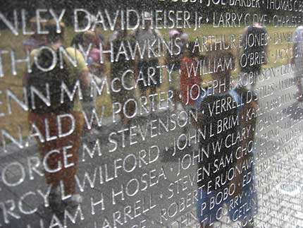
All names on the Vietnam wall in Washington DC was carved in Optima, a font designed by the legendary Hermann Zapf. Optima style is well-balanced between ancience and modernity, it’s said that Zapf used golden ratio in designing it!
Since it began long time ago, my obsession for typefaces has never stopped. From typography to calligraphy, from Latin letters to Chinese brush characters, from hand-writing to web fonts… typefaces represent the most basic, most intrinsic but most important to a visual identity: it’s not the thing they see, it’s the thing they read! Typeface, it’s not about a style of writing or printing, it’s about the long traditions of hand writing, wood and metal letters printing continue into the digital age, it’s about aesthetics!
Nowadays, for typography, www is still the “lowest common denominator”, where just a handful of typefaces meet. It’s really hard to demonstrate the beauty of typefaces on the web. Previously I had a post on web embedded font, other solutions exist using Flash or JavaScript to render fonts on web pages. Up-to the present day, I’ve never felt pleased with the aesthetics quality of any Vietnamese font yet!
Take a look at our major (printed) newspapers (e.g: Tuoi Tre, Thanh Nien…) and even art & designing magazines, most of them sticks to the very basic (and ugly) Arial or Verdana, why don’t they consider using more elegant ones like Helvetica or Palatino? (these have Vietnamese Unicode support already) Yet, there are also many nice free font families to use: Gentium, Liberation, DejaVu, Linux Libertine, Droid, Bitstream Vera…
Look at the prices of professional fonts sold on many type foundries, you would understand values of the work! A font designer is somewhat similar to a sword-maker, their names don’t appear on publishing, book, newspaper… but those products bear the tacit pride of centuries-old craftsmanship. Image below: the flowery Zapfino, named after Hermann Zapf, shipped with Mac OS X, now serving as test-bed for many font-rendering engines.
