
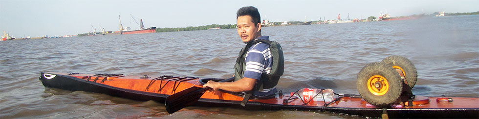
The classical SVG example rendered using a thin OpenVG layer on top of OpenGL (or Quartz) on a Mac. This is also to say goodbye to the old Lunar year (year of the tiger) that is ending!
 inished with my survey on vectorial graphics, in details, about rendering SVG using Quartz, OpenGL (ES) on Mac, iOS and some Android flatforms. I’d had the chances to systematize more my knowledge on vectorial: path, stroke, anti – aliasing, solid, gradient and pattern fill, etc… Todays, people’s all talking about 3D, OpenGL, DirectX, etc… While few mentions much about 2D stuffs, I’ve traced back some historical evolution paths, since I believe that it’s through history would we understand technologies.
In the beginning, there was… PostScript
It was John Warnock who kindled the idea, he joined Xerox in 1978 and an early version of PostScript (named InterPress) became the language to drive a laser printer. Laser printer was then a revolutionary device, which offers extraordinary graphics compared to the capability of dot or matrix printers. Warnock left and founded Adobe in 1982, the company that produced well – known graphics softwares including Illustrator, king of the vectorial editors.
Then there was DPS, PDF and Quartz
But it was Steve Job who realized the superiority of PostScript and urged John Warnock to popularize it. When Steve Jobs left Apple and started NeXT, he co – developed with Adobe DPS – Display PostScript, a derivative of PostScript – the language that drives the NeXT computer’s graphics system. When Steve has got back to Apple, DPS then evolved into what is now known as PDF, and Quartz is the C binding that bridges traditional Unix programmers to the Mac graphics world.
The X window system
The X’s designers also started with a PostScript RedBook in hand. But due to various reasons including the lack of in – depth consensus about vectorial, X maintains until now low level of PostScript support. The X server can only handle basic PostScript commands (it can’t even draw splines). X took a hybrid approach using both vectorial and raster – based solutions to the problem. Also the Unix root has an impact: X is the only true client/server windowing system to the current day.
Until now, the NeXT computer remains an idealistic symbol, pure vectorial remains a pursuit, perhaps for higher – standard devices, such as with this Backbone:
Backbone is an attempt (our attempt) at creating a Really Good Desktop. The metric we use for “Really Good” is our own. In short, to us, to carry on the NeXTSTEP® and OPENSTEP® spirit!
The Windows’ GDI
Born to be the youngest of all graphics systems, GDI learns nothing from it predecessors. Neither it is device and resolution independent (like Macs) nor a true client/server system (like X). GDI sticks to screen and the pixel unit with quite a lot implementation flaws. These flaws won’t become obvious until we come to serious editing, publishing and printing: text documents and graphics designs would never has the on – screen – display and printing qualities we would expect, though various 3rd party softwares would come to rescue somewhat the situations.
Then, things change with time
The 2D graphics systems on Mac, Windows, Unix… all has different origins, and all targets different real – world problem domains. All has hardware acceleration to various levels and qualities, and it’s hard to compare them in some cases. To the present day, no system is known to keep the original idealistic model that uses pure PostScript: X has been mixed from the beginning, Mac & iOS have switched to raster to some extent, GDI is essentially pixel – based. Then come the wind of change! It would be another story, another evolution path, but today, 3D hardwares has become quite popular with reasonable prices. It’s counter – intuitive to treat 2D as a separate part from 3D, and the trend is merging 2D to become a subset of 3D rendering. However, the process hasn’t been very easy, it would take some more time to reach maturity:
-
WPF (Windows Presentation Foundation): first came with Windows Vista, GDI now runs as part of DirectX 3D rendering environment. Vista was not a success indeed!
-
QuartzGL: Quartz2D runs on top of OpenGL since OS X 10.2 (Jaguar). However, QuartzGL is not enabled by default even in the current version (10.6 – Snow Leopard) since it’s still quite buggy.
-
GLX & AIGLX: both has some implementation problems and is competing to each other to become the official 3D extension for X.
Taken an arbitrary GDI’s API (such as MoveTo, LineTo…) we can see the parameters’ type is integer, which is in reality the pixel unit. The Quartz’s counterparts are always in float, a virtual unit so that the APIs can be device and resolution independent.
The so called “GDI printer” is actually a bitmap device, it lacks a PostScript interpreter and hence need to be attached to a computer to do the actual computing. Reason is obvious: cheapness, adding a PostScript interpreter would significantly raise the cost!
 little fun with gaming physic, written using Three.js, the 3D library built ontop of HTML5 and WebGL. Physics engines like ODE or PhysX support a wide range of simulation: rigid body, soft body objects… While those engines are powerful, they are somewhat weak in scalability, e.g: to simulate the flag below, we need to create an array of hundreds of objects, which may not really feasible on small devices.

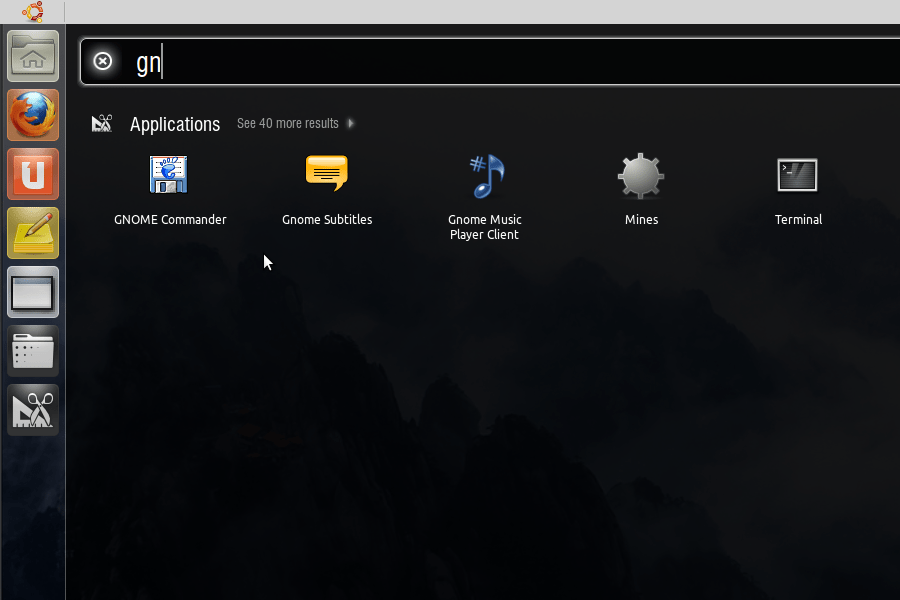

 am trying Ubuntu’s new desktop introduced lately with Natty Narwhal (11.04). After heavy development phases,
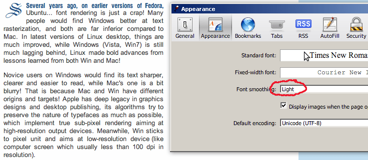
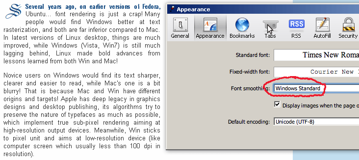
 everal years ago, on earlier versions of Fedora, Ubuntu… font rendering is just a crap! Many people would find Windows better at text rasterization, and both are far inferior compared to Mac. In latest versions of Linux desktop, things are much improved, while Windows (Vista, Win7) is still much lagging behind, Linux made bold advances from lessons learned from both Win and Mac!