

Screenshots of the new Unity desktop. There’s certainly a harsh non – exclusive competing between Unity and GNOME Shell. A proxy war between Ubuntu and Fedora Core, which is in turn a proxy war between Canonical and Red Hat.
Eventually, it’s user experiences that would decide which desktop is best (and best for what), and that’s still a long way to come. But technically, Unity is the first huge bold break from tradition, whose real goal deep inside is replacing completely the age – old heritage of X window system by an OpenGL – based one, a problem partially addressed in my previous post.
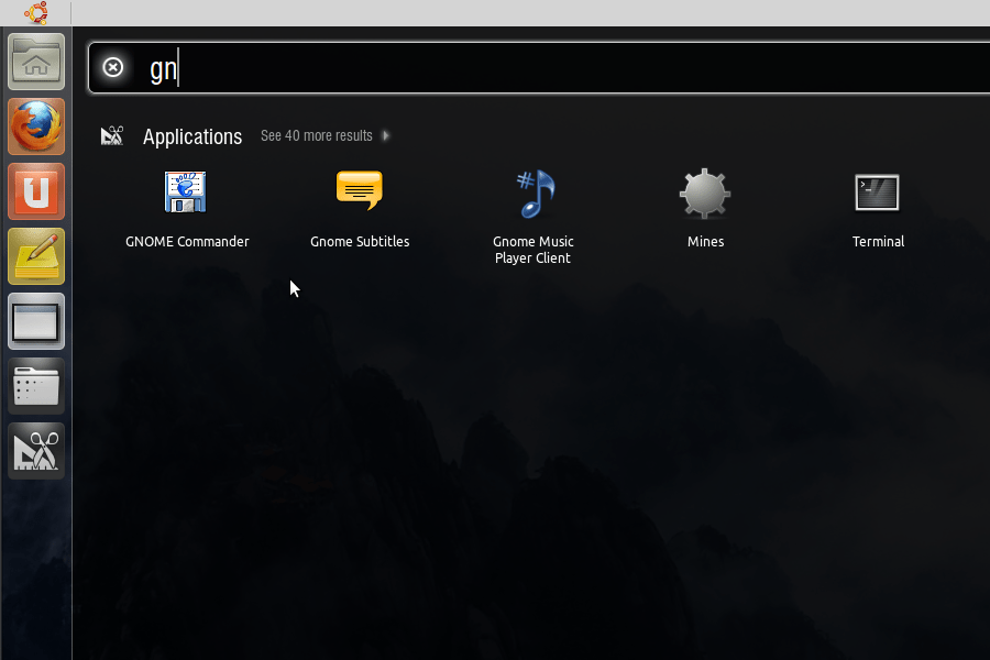
I am trying Ubuntu’s new desktop introduced lately with Natty Narwhal (11.04). After heavy development phases, Unity has reached its alpha stage, a massive move replacing the GNOME desktop environment by a completely new one written from scratch. I’ve read too many negative reviews about Unity already, but personally I think this is a good move. Developed from Ubuntu’s Netbook Remix (which I didn’t like much, you don’t have to maximize windows like that all the time), switched from Clutter to Compiz 3D windows compositing system (my last experiment with Clutter also hinted potential performance problems), the new Unity shows a huge shift toward Mac’s style desktop. Though there’s still lots of bugs and missing features, a few things can be said about this new Unity.
First, people complains about the break from the norms, some hates Unity because it stops their accustomed habits. The GNOME community (with its long development history) can feel like being betrayed. But for all I knew after some years in graphics, UI design is the job of personality, it’s the task of a small group who decides what is “nice and beautiful”, and which is the way (for other users) to follow, it’s not the task of a committee (that is “People’s Committee” I mean 😬). As a developer, I’m often in the self – conflicting state of wondering what is “nice and beautiful”, modify over and over again some simple UI widgets. It’s no strange that UI always becomes a huge diversity (and problems) for community – driven projects. Key requirements for a UI system in my opinion are: simplicity, consistency and elegance.
For consistency and simplicity, Unity is a big step forward, reasons given that GNOME has become too complex and inconsistent (then how about the much more complex KDE?). Maximized windows have the caption and menu bars all incorporated into the system bar on top, a feature clearly borrowed from Mac, yet further varied and developed. A simple dock bar is positioned on the left, and system menu button doesn’t bring up menu but a searching panel with which you can launch programs, open files… with a few key strokes. I like this much cause it offers a form of GNOME – Do: it’s harder to launch rarely – used items (especially if you don’t remember the names) but it’s more convenient for frequently – used ones. After all, lexical memory is much faster than spatial memory, if one has been trained to that.
One more apparent physical factor is that the vertical screen space is more scarce compared to horizontal space, and 16:9 screens has become quite popular. To conserve useful screen space, UI must make constraints to the caption, menu bars, especially tool bars, there’s even recommendations on eliminating the status bar and minimizing scroll bar at Mark Shuttleworth’s (Canonical’s founder) blog. For scroll bar, that’s quite sure a mimic and modified version taken from iOS. Actually with my recent experiences with Mac and iOS, there’s still a lot of lessons to be learned from these two OSes on how to use space efficiently: remove heavy windows decorations and borders, use lighter UI fonts, smaller and more symbolic icons, design simpler widgets… and in cases even sacrifice some less – used UI features.
The trend of UI becoming simpler and more consistent is quite obvious. Efficient uses of space is the key, but spatial is not all for user experiences: keyboard and mnemonic are also important parts of the learning path (UI effects can be fancy, but over time, people get to love the simplest keystrokes that do the job). The third factor: elegance is even more a topic of debate, people can largely agree to what is simplicity and consistency, but what is aesthetics remains mysterious! Unity claims that it would directly compete Mac on UI designs and user experiences, but my opinion is that its aesthetic aspect is still far behind that of Mac, e.g: Compiz’s effects are numerous, but actually not very fine – tuned compared to the smaller set of animations Mac offers… And even Mac still doesn’t satisfy my eyes in quite many cases…