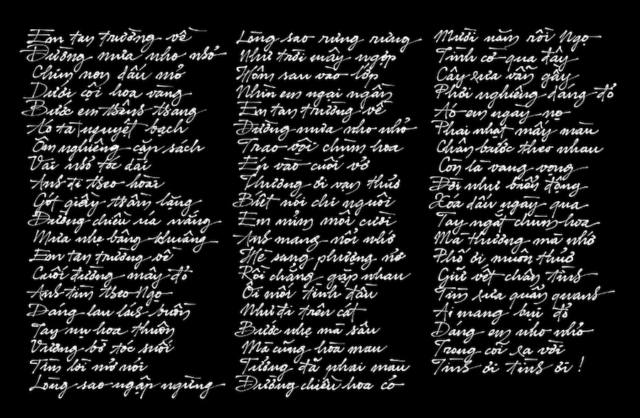
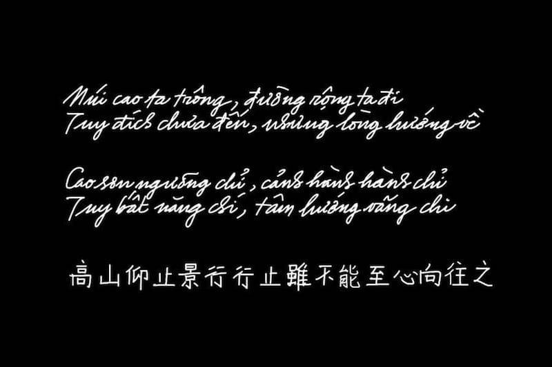
Thôi thì em chẳng còn yêu tôi, leo lên cành bưởi khóc người rưng rưng… Nhớ xưa em rũ tóc thề, nhìn trăng sao nỡ để lời thề bay. Đợi nhau tàn cuộc hoa này, đành như cánh bướm đồi tây hững hờ…
Mỗi thời có một loại âm nhạc, tôi rất ít khi có ý kiến về âm nhạc của giới trẻ hiện tại, vì ai cũng có nhu cầu của riêng mình, thời mới rồi sẽ có những hướng đi mới, cho dù là nó sẽ dẫn đến đâu. Trong một nhận xét “thẳng thắn”, nhạc sĩ Phạm Duy bảo: âm nhạc bây giờ thiếu rung động và thiếu sự sang trọng. Riêng tôi thì nghĩ nó còn thiếu cả sự tử tế! Một kiểu nói nhẹ nhàng nếu không muốn bỉ ra mặt: âm nhạc thời thổ tả
! Không muốn vơ đũa cả nắm nhưng phải nói là đa số thính giả cả già cả trẻ bây giờ từ trong cảm nhận đã: không thể hiểu, không thể biết được về cái họ không có!
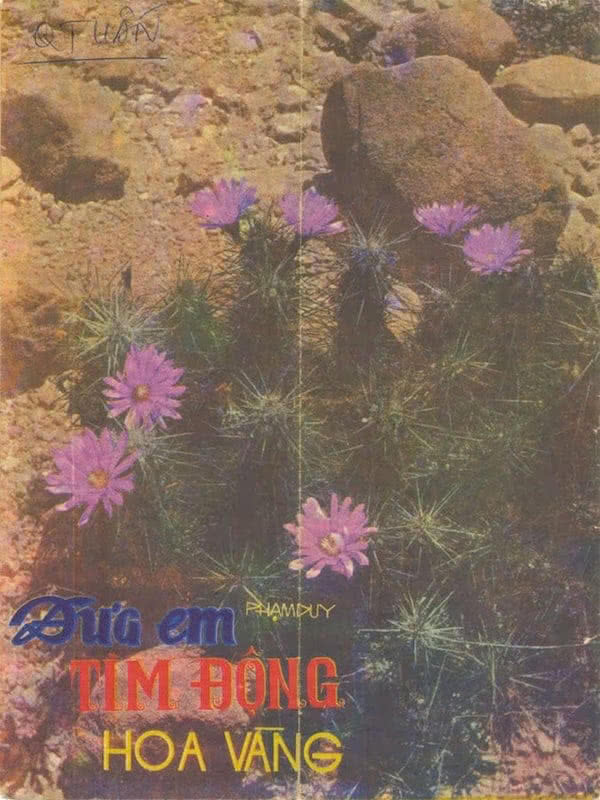
Đưa em tìm động hoa vàng - Thái Thanh ►
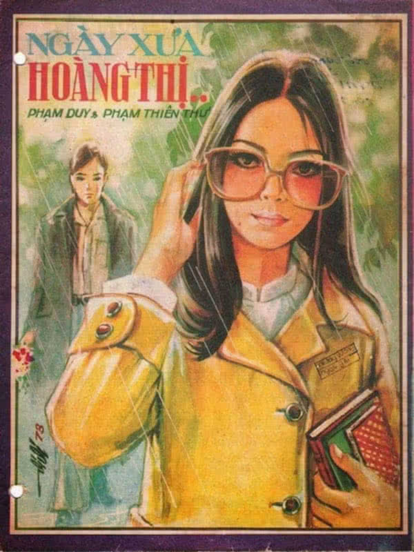
Ngày xưa Hoàng thị - Thái Thanh ►
Nhạc cũ, thực ra tôi rất ít khi nghe, chỉ là thi thoảng nghe tìm lại chút Hương xưa
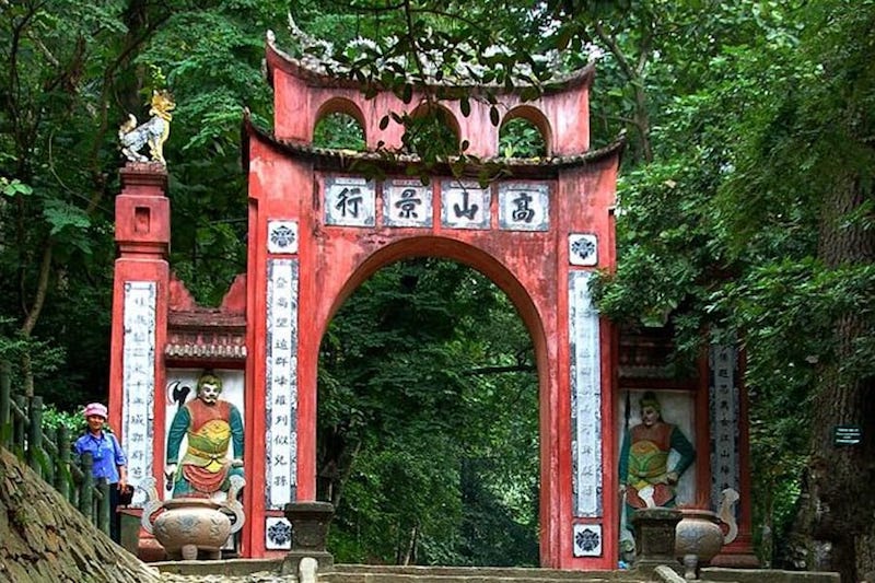
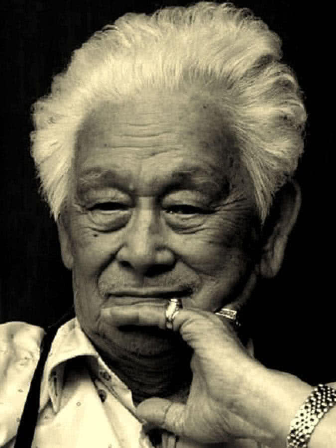
, cứ như là những điều đã quá tốt để có thể trở thành thật, cứ xa xa cách cách vậy mà có khi lại hay hơn! Ít nhưng mỗi khi nghe, dạo này thường chọn những bài nhạc Phạm Duy phổ thơ Phạm Thiên Thư: Ngày xưa Hoàng thị, Em lễ chùa này, Đời gọi em là đóa hoa sầu, Đưa em tìm động hoa vàng, và một số bài Đạo ca khác. Các ảnh bên dưới: chân dung hai tác giả họ Phạm, một âm nhạc, một thi ca, và những tác phẩm làm say lòng người!